I measured an acceleration spectrum of a washing machine with phyphox(Physical Phone Experiments).
I watched movies of phyphox featuring acceleration spectra of washing machines before. I think it’s easier to understand the physical meaning of acceleration spectra of vibrating equipment compared with audio spectra and magnetic spectra.
I recorded the vibration of the washing machine below when it’s in dehydration process.
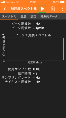
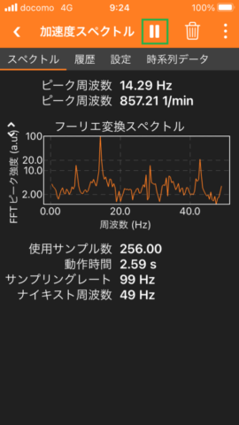
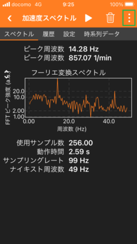
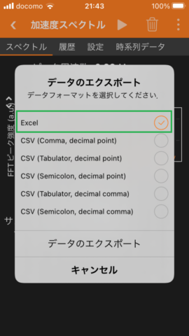
1. The pictures below show the procedure to record an acceleration spectrum with phyphox. In the last picture, I typed my email address to receive an Excel data file with email.
A recording starts when the button is pushed in second picture and it finishes when the button is pushed in third picture.
I put my smartphone on the lid of our washing machine when the washing machine is in dehydration process and recorded the acceleration spectrum.
2. The screenshots below show the recorded data. I recorded the data when the rotation speed of our washing machine had the highest value.
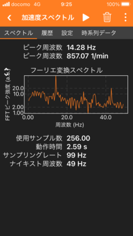
First picture shows the acceleration spectrum. The horizontal axis is the frequency and the vertical axis is the magnitude of the frequency components. The vertical axis is displayed in logarithmic scale. The frequency component with a frequency of 14.28 Hz is four times larger than the other frequency components. The frequency component of the acceleration of the smartphone placed on the lid of the washing machine has a large value at about 14Hz because the number of rotations of the washing machine was about 14 times per second.
The accelerometer data are measured at time intervals of just over 0.01 second (99Hz). The maximum frequency of vibration (Nyquist frequency) that can be measured is 49Hz, half the sampling rate of the sensor data (99Hz) .
The operation time is shown as 2.59 seconds because the number of samples used is 256 and the time intervals for sampling are about 0.01 seconds. Using the 256 samples of data from the past 2.59 seconds as input, the magnitude of each frequency component is calculated with FFT (Fast Fourier Transform) algorithm.
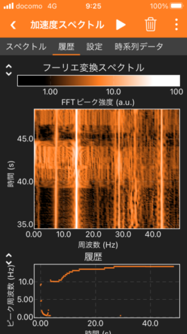
The center graph of the second image shows the history of the magnitude of each frequency component. The vertical axis is the elapsed time and the horizontal axis is the frequency. Large frequency components are shown in white and small frequency components in black. The results in this figure are from about 35 to 50 seconds after the start of measurement. The component with a frequency of about 14 Hz has a larger value than the other frequency components.
The bottom graph of the second image shows the time variation of the peak frequency. The peak frequency was about 10 Hz at 5 seconds after the start of measurement. The peak frequency was about 14 Hz after 30 seconds because the rotation speed of washing machine increased.
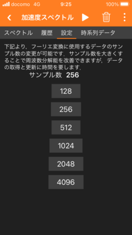
As you can see in the third image, you can also change the number of sampling data used in FFT (Fast Fourier Transform). The larger the number of samples, the better the frequency resolution (finer intervals between the frequencies on the horizontal axis). However, it takes more time to acquire and update the data.
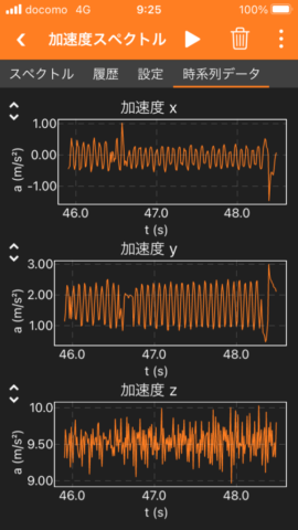
The fourth image shows the measured 3-axis accelerometer values.
3. I plotted the Excel data exported from phyphox with Google Charts.
In the figure below, the horizontal axis is the frequency and the vertical axis is the magnitude of each frequency component calculated by FFT. Unlike the first figure in section 2, the plot is not logarithmic. The frequency component at 14.28 Hz, which is the rotation frequency of the washing machine, is larger than the other frequency components.
In the figure below, the horizontal axis is the elapsed time from the start of measurement and the vertical axis is the peak frequency. The peak frequency of the washing machine vibration was about 10 Hz at 5 seconds after the start of measurement because the rotation speed was about 10 Hz. The rotation speed gradually increased to about 14 Hz after 30 seconds.
The following JavaScript was used to plot the two graphs in section 3.
<script type="text/javascript" src="https://www.gstatic.com/charts/loader.js"></script>
<script type="text/javascript">

google.charts.load('current', {packages:['corechart']});
google.charts.setOnLoadCallback(Spreadsheet);

function Spreadsheet() {
    const query = new google.visualization.Query('https://docs.google.com/spreadsheets/d/1uJai_2ZgZIkwJCBb2YSHFrjIjQxkhKpI1IsPx7SGMzc/edit?usp=sharing');
    query.send(drawChartFFTSpectrum);

    const query_peak_history = new google.visualization.Query('https://docs.google.com/spreadsheets/d/1uJai_2ZgZIkwJCBb2YSHFrjIjQxkhKpI1IsPx7SGMzc/edit?usp=sharing&gid=176809578');
    query_peak_history.send(drawChartPeakHistory);
}

function drawChartFFTSpectrum(response) {
    const data = response.getDataTable();
    const numRows = data.getNumberOfRows();

    // acceleration spectrum
    const options = {title: 'phyphox acceleration spectrum',
                     hAxis: {title: 'Frequency [Hz]'},
                     vAxis: {title: 'FFT Magnitude'}};
    const chart = new google.visualization.LineChart(document.getElementById('acceleration_spectrum'));
    chart.draw(data, options);
}

function drawChartPeakHistory(response) {
    const data = response.getDataTable();
    const numRows = data.getNumberOfRows();

    // Peak History
    const options = {title: 'phyphox peak history',
                     hAxis: {title: 'Time [s]'},
                     vAxis: {title: 'Peak Frequency [Hz]'}};
    const chart = new google.visualization.LineChart(document.getElementById('peak_history'));
    chart.draw(data, options);
}
</script>
The Excel data exported from phyphox has been uploaded to Google Sheets in the same way as in this Blog.
When plotting the Peak History graph, the gid parameter is added to the end of the sheet URL, as in &gid=176809578, to refer to a sheet other than the first sheet.(I referred to this page.)


